COVID-19 in Ireland
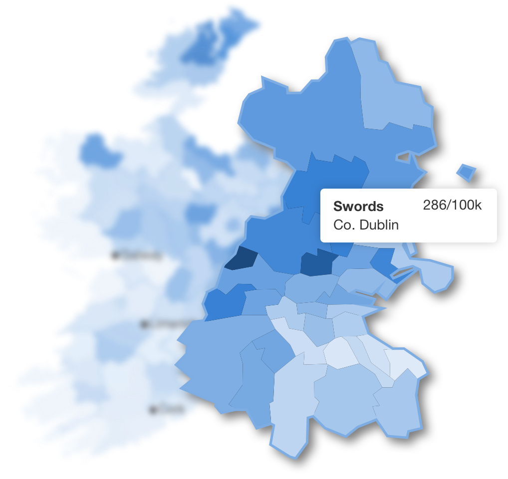
During the pandemic I came across a lot of COVID-19 charts so I decided to do my own but focusing on my country - Ireland. The data available allowed me to map the spread of the virus down to the local electoral area so you could see how your area was doing compared to others. For the Europe choropleth I animated the data over a year so you see how different countries where hit at different times.
When the vaccination rollout was underway I added more charts. The most important question I wanted to know is when would most people be vaccinated and was it in time for the summer holidays. I had a Python script running daily to keep the data up-to-date but had to stop it when the health department has hacked which stopped the release of the data.